Android 17 Leak: Google Embraces the “Glassy” Translucent Look
Leaked internal builds of Google’s upcoming operating system, codenamed “Cinnamon Bun,” suggest that Android 17 will mark a significant departure from the flat, solid colors of previous generations. According to recent reports and screenshots shared by insiders like 9to5Google and RKBDI, Google is preparing to introduce a system-wide “frosted glass” blur effect that brings a new level of depth to the user interface.
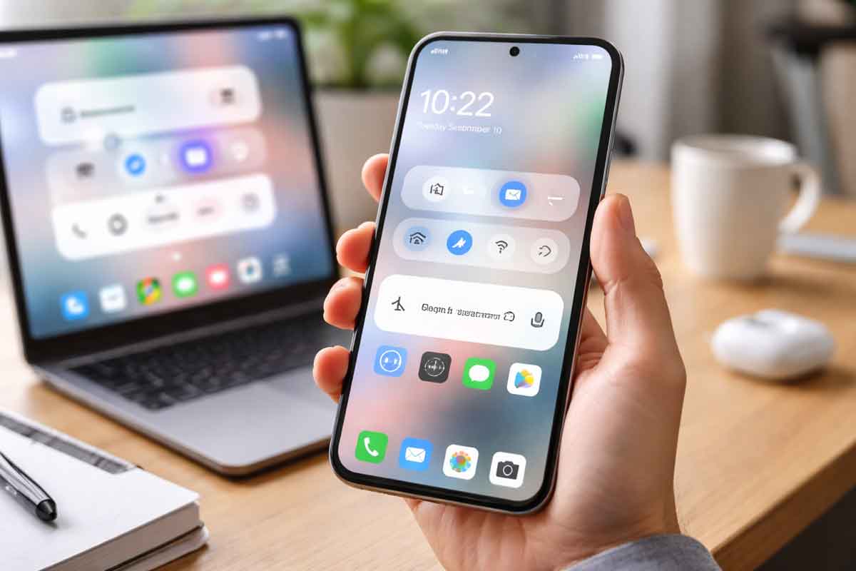
This design shift is most visible in core system elements. The volume slider, once a solid block, is now housed in a translucent pill-shaped container. This allows the user’s wallpaper or the active app’s icons to subtly peek through the menu. Similar translucent treatments have been spotted in the power menu and full volume sheets, all of which are reportedly tinted by Google’s Dynamic Color engine to maintain a cohesive theme.
For long-time Android fans, this move feels like a more refined evolution of the “Material 3 Expressive” language introduced in Android 16. While some critics are already calling it a nod to Apple’s “Liquid Glass” aesthetic in iOS, early analysis suggests Google’s implementation is more subtle and less “wet” in appearance. It’s a change that many users will likely find “premium,” though it may cause a slight polarizing reaction among those who prefer the high-contrast clarity of solid backgrounds.
Beyond the Blur: New Features Leaked
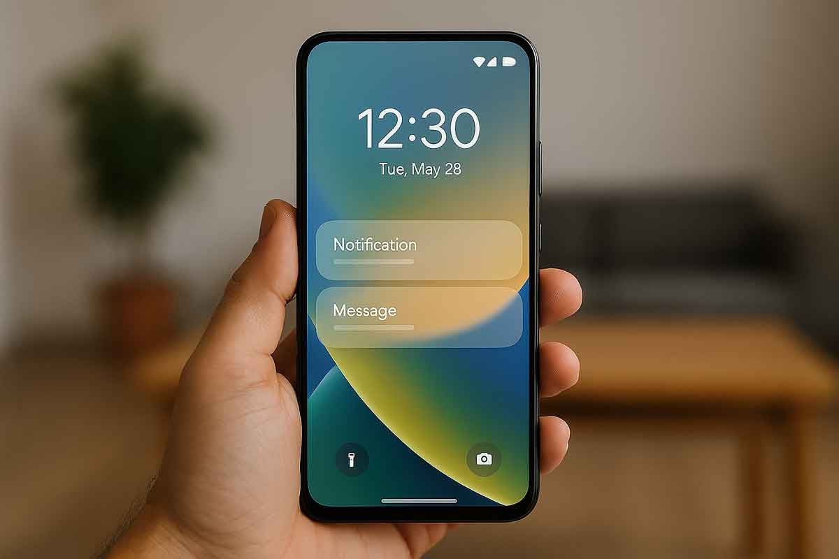
- Revamped Screen Recorder: The current chunky pop-up is being replaced by a floating pill interface. This new design includes streamlined toggles for recording device audio, microphone input, and showing touches, all while staying accessible as a overlay.
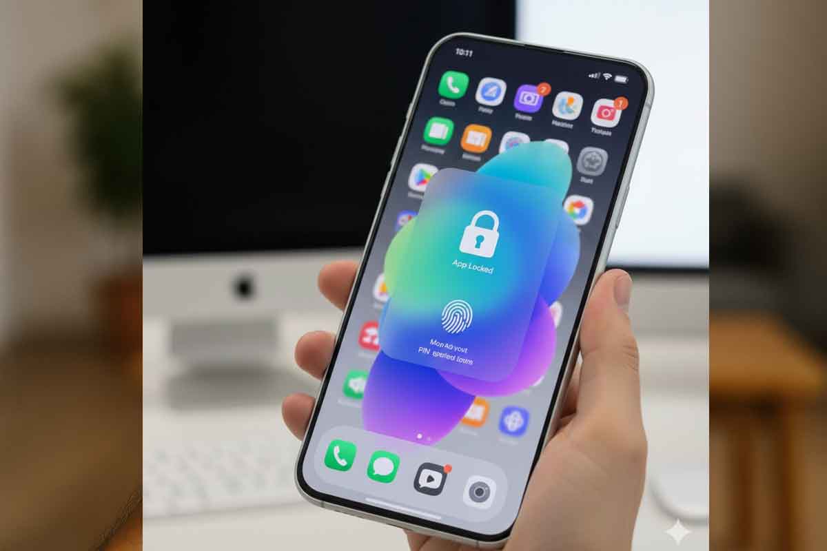
- Native App Lock: A highly requested feature, Android 17 may finally include a built-in “Lock app” option in the long-press menu, allowing users to secure sensitive apps using biometrics or PINs without third-party tools.
- Split Quick Settings: Continuing a trend seen in some manufacturer skins, Google is testing a split layout where swiping from the left shows notifications and the right opens Quick Settings—a change that might be mandatory on foldables and tablets.
Analysts might read this as Google finally reaching design parity with high-end rivals while solving long-standing usability issues. Historically, such visual shifts often signal a “polishing year” where the focus is on experience rather than radical functional changes. Interestingly, this move toward translucency follows a decade-long cycle of flat design, mirroring the 100% increase in glass-like UI elements seen in recent desktop OS updates like Windows 11 and macOS.
If you’re an Android enthusiast, the best “what to do now” is to keep an eye out for the first Canary build, which replaces the traditional Developer Preview and is expected to drop in early 2026. Figures and specific visual transparency levels may shift once official updates arrive during Google I/O in May. Previous data on whether these blur effects will be available for third-party apps is not available in current reporting.
FAQ
Q. What is the “Cinnamon Bun” codename?
Cinnamon Bun is the internal dessert-themed codename for Android 17, continuing Google’s alphabetical tradition for major OS releases.
Q. Will the new blur effect slow down my phone?
While blur effects require more GPU power than solid colors, Google’s implementation is expected to be highly optimized for modern hardware, likely having a negligible impact on performance.
Disclaimer: This report is based on leaks from internal builds and unofficial screenshots. Final features in the stable release of Android 17 may differ significantly from these early previews.
Written by: Anil Sinha – Gadgets – News Hours18 – https://www.newshours18.com